Spring 2012 Fashion Trends: Bright and Pastel Colors
The spring 2012 runway shows may have ended, but Fashionistas everywhere are still thinking about the silhouettes, colors and inspiration that were sent down the catwalks. One of the biggest trends seen throughout the world for spring 2012 collections was the lack of neutrals and the introduction of color.
While colors have been a mainstay on the runway for the past several seasons, spring 2012 has given us a bold variety of colors to choose from. The past few seasons have shown bright and bold colors on the runways; and in some cases neon. Spring 2012 is giving the fashion world a choice of color. Colors are no longer limited to bright and bold hues; instead, spring 2012 offers everyone a choice-bright or pastel.
Louis Vuitton, and Paris designers in general, sent pretty pastels down the spring 2012 runways. The pastel shades evoked a feminine vibe; another continuing trend from 2011 into 2012. Pastels were shown in every color possible from baby pink to ice blue to soft yellow. The broad range of colors offer a breath of fresh air and an array of choices for shoppers when spring 2012 collection begin to hit store shelves.
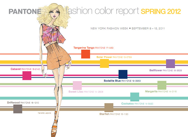
Although pastel hues made their mark on the Paris catwalks, bright and bold colors were a mainstay in New York, Milan, London and Berlin (they were also seen in Paris). Bold colors have already begun popping up on the Canadian catwalks for spring 2012; which are going on as we speak. Pantone, the world authority on color, reported earlier this year that orange or “Tangerine Mango” was the most ordered dye color for spring 2012 fashions; signaling the importance of this bright hue in the upcoming year.
While bold colors are obviously important for spring 2012, pastels are peeking back into fashion and their appearance on the Paris runways is proof that the soft shades are just beginning their reign as the new color palette in seasons to come. This isn’t to say that bold colors will fade into the background for fall 2012, in fact they are continuing to remain important, it just means that pastel hues will begin to gain importance, and are at the beginning of their cycle in the fashion world.