Color Trends


Fashion is back in black for the fall 2012 season

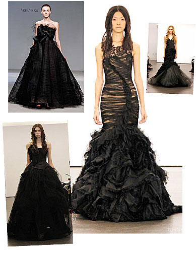
Just as the fashion world became excited about bright colors, pastels and neon hues, Vera Wang sent a black wedding dress down her fall 2012 bridal runway. To top the matter off, Milan Fashion Week for fall/winter 2012/2013 menswear, which ended on January 18, 2012, was a sea of black. Not only has black dominated the menswear runways for fall 2012, a few designers such as Emporio Armani, sent their womenswear collection down the menswear runways as well, and they were just as black.

Black has been a mainstay in the wardrobes of Fashionistas for decades; the hue never really went of style, it was just overshadowed by the bright colors of recent seasons. What used to be deemed an anti-establishment hue, black became cool in the 1990’s when minimalism ruled the runways and the streets.

The fall/winter 2012/2013 menswear runways may as well have had the same AC/DC tune blaring on the stereo’s, because 99% of the designers showed up with their collections “Back In Black” and the beautiful bright colors of spring 2012 were nowhere to be found. It should be interesting to see what fall 2012 brings for women when New York Fashion Week kicks off on February 9, 2012. Will we be in a sea of dark and dismal black? Or will autumn hues of orange, green, burgundy, chocolate brown and deep navy grace the runways as seen in many pre-fall collections? We shall see. . .
bride


AkzoNobel ColourFutures declares Terra Cotta Rose the International color of 2012

There are many color experts in the marketplace who conduct a thourough analysis of trends and predict which colors will be hot during any given year. Every year fashion magazines, news outlets and bloggers pick up on the “color of the year” as declared by global color experts. While we talked about Pantone’s color of the year, Tangerine Tango for 2012 in December, AkzoNobel has released their color for 2012, which happens to be Terra Cotta Rose.

AkzoNobel was the first company to begin declaring a “Color of The Year” back in 2003 when the company put together ColourFutures and predicted the “IT” color for 2004. For 2012, AkzoNobel has declared Terra Cotta Rose the color of 2012, which is a warm reddish-pink hue.

While AkzoNobel’s colors tend to be found in paints and fabrications used in interior design, the spaces we live in are also a reflection of who we are and our lifestyles. This is why the hot interior design color for 2012 can also be found in the fashion industry. Shades of red have already been spotted in pre-fall 2012 collections which designers and brands such as Alice + Olivia and Rachel Zoe have released through photographs to the general public. Shades of red have also been spotted alongside orange hues on store shelves for the spring 2012 season; proving that red is an important color for 2012.

Terra Cotta Rose is a warm, pinkish-red which can easily blend with warm and cool colors; making it an easy color to work with when it comes to creating the perfect color blocked ensemble for spring or summer. The warm hue is also a great transitional color from spring into fall; making it a smart investment color.

*Special THANK YOU to Barbara from AkzoNobel for taking the time to speak with me about the intricate process of gathering color experts from around the globe to meet and discuss current color trends. The meeting involves twenty global experts who discuss color trends in their region. The meeting determines which colors will be hot for the following year on a worldwide scale. To see the full report, please visitcolourfutures.us

red


The softer side of spring 2012

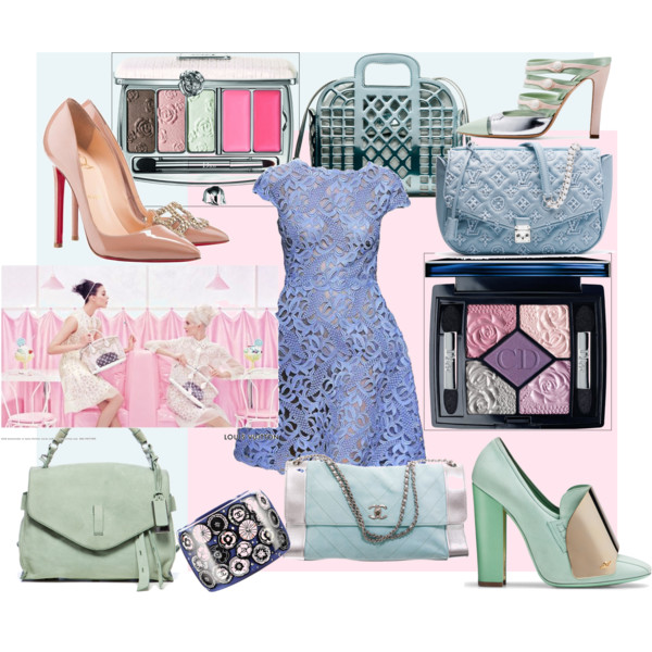
Spring 2012 is all about color. While bright and bold colors are hot, Paris gave the fashion world another color palette to think about; pastels. The Paris pastel trend seemed to be nothing more than a mere introduction when it graced the runways during Paris Fashion Week last fall. Normally when a trend first appears on the runways, store buyers and Fashionistas take notice, but do not go full force into wearing the trend. Not true this spring 2012 season. Pastels are more important than one would think.

When Paris introduced pastels, many forecasters thought it was an introduction and that in 2013 and 2014 pastels would overtake the bright colors we have grown to love during the past year. Although bright colors are highly sought after and important for spring 2012, pastels are taking an equal place in the world of spring fashion.

Pastels shades are being shown in many forms from color blocking to stand-alone hues. Pastels are being shown with whites, creams, pale beige and soft neutrals on feminine silhouettes; playing up the sweet side of the pastel color spectrum.

There is no denying that pastels are a fast up-and-comer. The hues are being shown in make-up for spring as well as on store shelves everywhere. While this is no signal to stop investing in bright colors, it does tell shoppers to mix it up in spring 2012 and invest in both bright colors and pastels. Look for pastel florals, stand-alone colors and soft color blocking. Pastels are a great way to feel fresh and perfect for days when orange, the color of 2012, is just too bright for the occasion.

y (9)