new york fashion week


Fall 2013 color report

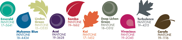
Pantone has released the fall 2013/winter 2014 color report! With New York Fashion Week autumn/winter 2013/2014 starting today, the new fall color palette is being revealed on the runway. Pantone has put together a fabulous report which showcases the top ten colors for fall 2013.

In fall 2012 we enjoyed a colorful palette which was vibrant and flowed easily from the cheery colors we enjoyed in spring 2012. For fall 2013, the color palette is more somber and offers a more traditional look at colors. Instead of bright hues, the colors are darker and more on the neutral side. The color of 2013, Emerald green is still important and as are blue, purple and pink; but the colors are more like “splashes” which liven up darker ensembles and overall looks.

What do you think of the fall 2013/winter 2014 color report? Join us on Facebook and let us know!
fall2013colorreport


New York Fashion Week spring 2013 trends from the runways

New York Fashion Week ended last week and left Fashionistas everywhere with something to covet for the spring/summer 2013 season. The overall looks from designers offered colorful combinations on soft fabrics. There was a 1960’s vibe and hemlines dropped below the knee. Shoes were lower to the ground and toes got a little pointy. Handbags were either classic and structured or soft in the form of a hobo. Some designers opted for neutral hues while others continued with bright colors into the New Year. There were prints, florals and playful patterns. A little bit of kitsch remained on the runway for 2013 and styles were a little more casual than what was shown in 2012.

Here is a snapshot of what was hot on the runways:

Fabrications:

Silk * Lace * Leather

Colors:

White * Black/White * Black * Beige *Cobalt * Bright Colors mixed together * Metallics *Neutrals

Handbags:

Flowing silhouettes with structured handbags * The hobo returns

Shoes:

Pointed toes * Flat sole shoes *Ankle straps

Apparel:

Longer hemlines * 1960’s silhouettes * Stripes * Prints * Florals * Leopard print

There you have it! It should be interesting to see which of these land on the streets in spring 2013!


Spring 2013 color report from Pantone has arrived

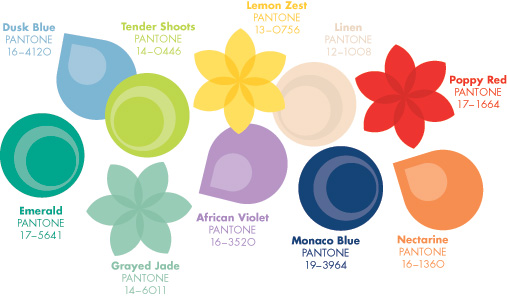
Pantone released the spring/summer 2013 color report today and it has given Fashionistas everywhere a sneak peek into the ten hottest hues for the upcoming spring 2013 season.

The fresh color palette is slightly softer than it was for spring 2012 and it appears that any shade of blue will be hot for 2013. After all, earlier this year Pantone declared that blue would be the new black for 2013; according to this chart, it will be!

Since Pantone’s predictions are based on New York designer preferences, it does appear that the soft pastels from Paris in 2012 have traveled to our side of the globe and mixed in with our bright hues from 2012. The softer colors are still cheery and bright; just not as neon as originally forecasted.

What do you think of the spring 2013 color palette? Do you have a favorite hue?

spring2013colorreport